Education - knowledge base

This section of site contains articles about various front-end tools and technics. Even if you are experienced professional, it's nice to have reminders and pointers to get you kick started when needed. This especially works for processes you will not repeat on daily bases.

Grunt.js

Grunt.js is the JasvaScript task runner built for high automation of repetitive task like minification, compilation, unit testing, linting, etc.

This article contains several maulas for Grunt usages in Odyssey system about following topics:

Grunt setup and Sass compiler

Images project already contains configured Grunt poject but you need to install few things in order to use it.

Step 01: Install Node.js

Grunt and Grunt plugins are installed and managed via npm, the Node.js package manager. Download and install latest stable version avialabele on Node.js official website in order to run Grunt task on your computer.

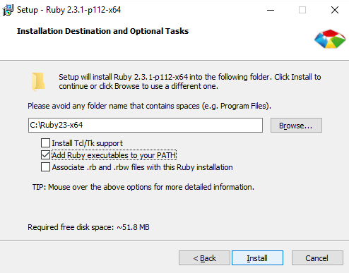
Step 02: Install Ruby

Before you start using Sass you will need to install Ruby. The fastest way to get Ruby on your Windows computer is to use Ruby Installer. It's a single-click installer that will get everything set up for you super fast. The installer will also install a Ruby command line powershell application that will let you use the Ruby libraries.

Installation process is straight forward, but you need to check the “Add Ruby executables to your PATH" opton as showen on the image.

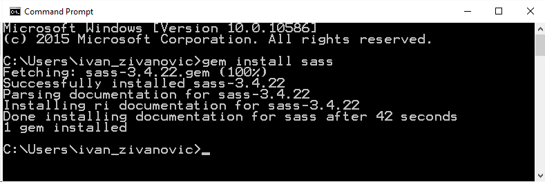
Step 03: Install Sass

Ruby uses Gems to manage its various packages of code like Sass. In your Command Prompt window type:

gem install sass

This will install Sass and any dependencies for you.

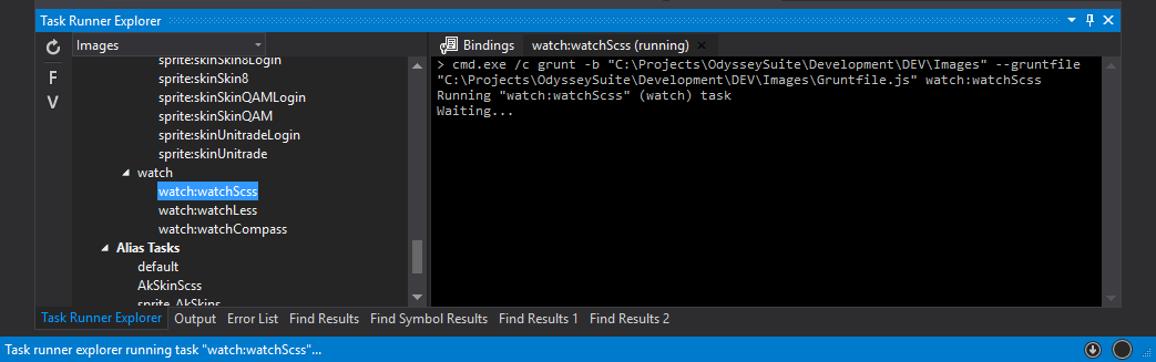
Step 04: Use "Task Runner Explorer" (TRE) in Visual Studio

If this is your first time using Grunt, you will need to show TRE in Visual Studio. To do that go to View > Other Windows > Task Runner Explorer, or simply pres Ctrl+Q and start typing "Task Runner Explorer" and it will appear as the only option.

In order to compile SCSS placed in Images project, select "Images" from the top left select list in the TRE window. After all task are listed, scroll down to the bottom, find "watch:watchScss" task and run it. This will start selected process and it will write "Waiting..." in TRE console on the right.

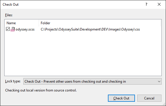
If you are using server workspace CSS file(s) will not be check out automatically, which will cause task failure. Select targeted CSS files, right clik on selection and choose "Check Out for Edit..." option. In prompted window select "Check Out - Prevent other users from checking out and checking in" as the Lock type.

New Grunt project

Existing Grunt porjects will cover all curent development needs, but if you need to start a new project at some point you can do it following this simple steps.

Step 01: Installing the CLI

In order to get started, you'll want to install Grunt's command line interface (CLI) globally. Run your Command Prompt as Administrator and copy this command:

npm install -g grunt-cli

This will put the grunt command in your system path, allowing it to be run from any directory. Note that installing grunt-cli does not install the Grunt task runner! The job of the Grunt CLI is simple: run the version of Grunt which has been installed next to a Gruntfile. This allows multiple versions of Grunt to be installed on the same machine simultaneously.

Step 02: Create package.json file

The package.json file should be placed in the root of your project. This file defines data about the project such as the project name, version and author. The package.json file is also responsible for managing dependencies. The devDependencies property defines the different packages that are needed for your application.

Copy this code to package.json file in order to make a clean start and we'll install Grunt in next step.


{
  "name": "project-name",
  "version": "0.1.0",
  "author": "Quantum - AutoMARKET",
  "devDependencies": {
  }
}
            

Step 03: Installing Grunt

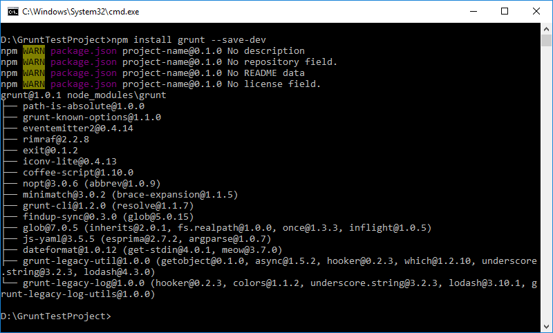
Now that we got new project, we can add some modules to it. Grunt and it's plugins are npm packages that needs to be installed so we can use them. Open Command Prompt and navigate to project root directory. Copy this command to install Grunt module and add it as the develoment dependencie.

npm install grunt --save-dev

This will update package.json file adding grunt in "devDependencies" providing other team members whit the instruction for setting things up in their environment easily. During the istallation some errors will be occured, but that does not prevent process from completeing successfuly. Those errors are ecountered because we have not all parameters needed for node project, but we are not deloping node app this is just fine.

We will add one more moudel for start just have smoething to work with. In previous cahpter you can find instructions for installing Ruby adn Sass to your computer. Those are required for this module to work. To install Sass as the grunt module smiply copy this command to Command Prompt (new project's root should already be locaated):

npm install grunt-contrib-sass --save-dev

Step 04: Create gruntfile.js

The Gruntfile.js or Gruntfile.coffee file is a valid JavaScript or CoffeeScript file that belongs in the root directory of your project, next to the package.json file, and should be committed with your project source.

A Gruntfile is comprised of the following parts:

  • The "wrapper" function
  • Project and task configuration
  • Loading Grunt plugins and tasks
  • Custom tasks

This example shows the gruntfile script with the minimum code needed just to compile scss file to css.


// The "wrapper" function
module.exports = function (grunt) {

    // Project and task configuration
    grunt.initConfig({
        
        // TASKS - compile scss to css
        sass: {
            dist: {
                options: {
                    style: 'expanded'
                },
                files: {
                    'Content/css/master.css': 'Content/scss/master.scss'
                }
            },
            prod: {
                options: {
                    style: 'compressed'
                },
                files: {
                    'Content/css/master.min.css': 'Content/scss/master.scss'
                }
            }
        },
        
    }); // END - Project and task configuration
    
    // Loading Grunt plugins and tasks
    grunt.loadNpmTasks('grunt-contrib-sass'); // compile scss file to css

    // Custom tasks (default task must exist)
    grunt.registerTask('default', ['sass']);

}; // END - The "wrapper" function
            

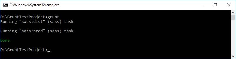
Step 05: Running Grunt from Command Prompt

In previous chapter we run the grunt tasks from the Visual Studio using Task Runner Explorer, but can be done from the Command Prompt as well. Simply navigate to your project's root directory and type "grunt". When this command is executed "default" task will be triggered.

CSS Preprocessors

In this brief introduction about CSS preprocessors you will see why they should completely replace handwritten CSS. Everybody know that writing CSS can be painfull, but after reading this artcile it will be clear how to ease that pain ;)

In Odyssey system we used two preprocessors: Less and Sass. At some point we decided to switch from Less to Sass because most of the components and frameworks use Sass. Some basic features will be presented in both languages side by side for easy comarising. Go trouht this sections to get basic understanding of preprocessors and their syntax:

What are CSS preprocessors?

CSS preprocessors take code written in the preprocessed language and then convert that code into the same old css we’ve been writing for years. Because they aren’t css, they aren’t bound by the limitations of css.The preprocessed language can give you more functionality than css as long as it eventually makes sure everything is output as css and works in a browser like we expect.

Long story short, preprocessors provides us with some programming principles while writting CSS. Thats the way to go if you want to write reusable code that is easier to organize and maintain. It goes without saying that this will save you a lot of time.

Variables

Think of variables as a way to store information that you want to reuse throughout your stylesheet. You can store things like colors, font stacks, or any CSS value you think you'll want to reuse. Basicly, it's all the samo but variable prefixes; Less uses @, while Sass uses $.


@mainColor: #0cf;
@fontStack: Arial, Helvetica, sans-serif;
@size: 16px;

.Selector {
    color: @mainColor;
    font-family: @fontStack;
    font-size: @size;
}
                

$mainColor: #0cf;
$fontStack: Arial, Helvetica, sans-serif;
$size: 16px;

.Selector {
    color: $mainColor;
    font-family: $fontStack;
    font-size: $size;
}
                

Compile into:


.Selector {
  color: #0cf;
  font-family: Arial, Helvetica, sans-serif;
  font-size: 16px;
}
            

Nesting, comments and few advices

Preprocessors will let you nest your CSS selectors in a way that follows the same visual hierarchy of your HTML. This feature provides us with more readable code and with very precise selectors. Whille that is a good thing, you should plan ahead where to start and where to end this "train" of linked elements. This example will target nav only hosted in element with the class .NavigationHost and not any other even with tha same structure from nav to a tag.

Since this example is using non of the other preprocessor's features (variables, mixins, color funciotns...) both Less and Scss code snippets are exaclu the same.


.NavigationHost {
    background: #440;
    nav {
        width: 100%;
        ul {
            margin: 0;
            padding: 0;
            text-align: center;
            list-style: none;
            li {
                display: inline-block;
                a {
                    display: block;
                    padding: 6px 12px;
                    text-decoration: none;
                }
                // a
            }
            // li
        }
        // ul
    }
    // nav
}
// .NavigationHost
/*
    Multi line comment
    which will be compiled
    into CSS file
*/
// What happens in preprocessor,
// stays in preprocessor
                

Compile into:


.NavigationHost {
  background: #440;
}
.NavigationHost nav {
  width: 100%;
}
.NavigationHost nav ul {
  margin: 0;
  padding: 0;
  text-align: center;
  list-style: none;
}
.NavigationHost nav ul li {
  display: inline-block;
}
.NavigationHost nav ul li a {
  display: block;
  padding: 6px 12px;
  text-decoration: none;
}
/*
    Multi line comment
    which will be compiled
    into CSS file
*/
            

This example also swowes how the comments works. Milit line comments (/* Comment */) are compiled into CSS, while single line comments (// Comment) are not. In my experience, I found it that is good practice to add single line comment after the selector's closing bracket to keep track of which bracket closes which selector. Witout them you can end up with a waterfall of unidentified closing brackets at the bottom of code section, and it would be really hard to find right one if you needed to insert some new code somewhere in the middle.

Mixins

Mixins are set of definitions that compiles according to some parameters or static rules. With them you can easily write cross-browser background gradients or CSS arrows etc.


@mixin MyRule($mainColor: #0cf, $fontStack: "Arial, Helvetica, sans-serif", $size: 16px) {
    color: $mainColor;
    font-family: #{$fontStack};
    font-size: $size;
}
.DefaultAppearance {
    @include MyRule();
}
.CustomAppearance {
    @include MyRule(#467, "Times", 30%);
}
.DiferentSize{
    @include MyRule($size: 2em);
}
                

Compile into:


.DefaultAppearance {
    color: #0cf;
    font-family: Arial, Helvetica, sans-serif;
    font-size: 16px;
}
.CustomAppearance {
    color: #467;
    font-family: Times;
    font-size: 30%;
}
.DiferentSize {
    color: #0cf;
    font-family: Arial, Helvetica, sans-serif;
    font-size: 2em;
}
            

Extend

Extends are useful for sharing a generic definition with selectors rather than copying it in. All extended selectors are grouped in compiled CSS. SASS extends every instance of extended selector that includes its child selectors and inherited properties. However, in LESS you can select every instance of extended selector by adding "all" attribute to extend method or you can select only the main instance. Extends are also chainable.

Math

Math operations can be used for standard arithmetic or unit conversions.

Partial files usage

Rather than using a one large file, separating your codes in small pieces is helpful for expressing your declarations and increasing maintainability and control over the codebase. You can group the similar code chunks in similar folders and import them to main css file. Also with import statement, frameworks can also be added to work packages.

Compiling into a plain CSS

At the last, but not least, you should NEVER use preprocessor file (.less or .scss) directly in HTML. Less could be use in that way if you provide link to less.js but tha is bad practice because it would have to be compiled on the run every time page is loaded, while Scss simply would not give you any results.

There are dozens of availabele combilers that will process your Less or Scss files into plain CSS.

Sass

Since Sass is the way to go, thi articel will demonstrate some of it's more or less advanced features.

Nested Properties

CSS has quite a few properties that are in “namespaces;” for instance, font-family, font-size, and font-weight are all in the font namespace. In CSS, if you want to set a bunch of properties in the same namespace, you have to type it out each time. Sass provides a shortcut for this: just write the namespace once, then nest each of the sub-properties within it.


.funky {
  font: {
    family: fantasy;
    size: 30em;
    weight: bold;
  }
}
                

.funky {
  font-family: fantasy;
  font-size: 30em;
  font-weight: bold;
}
                

Interpolation

You can also use SassScript variables in selectors and property names using #{} interpolation syntax:


if() function

The built-in if() function allows you to branch on a condition and returns only one of two possible outcomes. It can be used in any script context. The if function only evaluates the argument corresponding to the one that it will return – this allows you to refer to variables that may not be defined or to have calculations that would otherwise cause an error (E.g. divide by zero).


@mixin PageLayout($isHeaderSticky: true, $isFooterSticky: true) {
    .Header {
        position: if($isHeaderSticky, fixed, relative);
    }
    .Footer {
        position: if($isFooterSticky, fixed, relative);
    }
}
.PageWrapper {
    @include PageLayout(true, false);
}
                

.PageWrapper .Header {
    position: fixed;
}
.PageWrapper .Footer {
    position: relative;
}
                

@if directive

The @if directive takes a SassScript expression and uses the styles nested beneath it if the expression returns anything other than false or null:


The @if statement can be followed by several @else if statements and one @else statement. If the @if statement fails, the @else if statements are tried in order until one succeeds or the @else is reached. For example:


@for directive

The @for directive repeatedly outputs a set of styles. For each repetition, a counter variable is used to adjust the output. The directive has two forms: @for $var from #START through #END and @for $var from #START to #END. Note the difference in the keywords through and to. $var can be any variable name, like $i; #START and #END are SassScript expressions that should return integers. When #START is greater than #END the counter will decrement instead of increment.


@each directive


@while directive


@mixin directive


@content directive


@function directive


HTML essentials

Every web application uses HTML for page rendering, so it's crucial to understand at least basic concepts of HTML for everyone who needs to get involved with the View layer. HTML 5 brought a lot of changes to the web, especially semantic wise. However, this article will not be focused od semantics because it is not crucial for page layouts and UI styling.

Basic structure of a HTML document

HTML is a markup language for describing web documents (web pages). At the root of every HTML page, there is <html> tag which wrapps everything and it always has two childs <head> and <body>.

<head> section is designed to decribe HTML page to search engines and browsers and it's parsed first. Site icon and page title displayed as the browser tab identifiers are defined here. None other content defined in this tag is visible as the page content in browser window.

<body> section is wrapper for all content rendered on the viewed page.


<!DOCTYPE html>

<html lang="en">

<head>
    <meta charset="utf-8">
    <meta name="viewport" content="width=device-width" />
    <meta name="description" content="">
    <meta name="author" content="">

    <title>Text displayed in browser title bar</title>

    <link href="/Content/QFrame/css/QFrame.css" rel="stylesheet" type="text/css" />

    <script type="text/javascript" src="/Scripts/jquery-1.10.2.min.js"></script>

    <link rel="icon" type="image/png" href="/Content/QFrame/favicon/favicon-32x32.png" sizes="32x32" />
</head>

<body>
    <div>
        Page content goes here.
    </div>
    <script type="text/javascript" src="/Scripts/jquery-1.10.2.min.js"></script>
</body>

</html>

Block and Inline elements

In general, HTML elements can be divided into two categories: block level and inline elements.

Block level element

  • Can contain other block level as well as inline elements.
  • Takes the full width of its parent. (if not overriden by CSS)
  • Starts at new line. (if not overriden by CSS)

Inline element

  • Can NOT contain other block level elements. It can contain data and other inline elements.
  • Uses as much space as it needs. Will not take the full width of it's parent. (if not overriden by CSS)
  • Does not starts at new line. (if not overriden by CSS)

This sample shows diference betwean block level and inline elements in practice. Some styling is made through style attributes which is good only for demonstraion purpouses. In the real life, elements would have classes and they would be styled with CSS.

This example HTML can be found in Images project at following location:
Views > Shaed > Examples > HtmlSample.cshtml


<article style="padding: 8px 15px; border: 1px solid #ccc; background: #e1f4ff;">
    <h1 style="background: #fd7;">This title is H1 tag</h1>
    <div style="width: 75%; background: #ff6a00; color: #fff;">
        DIV is generic tag used for wrapping content in block level element. This one is wide 75% of it's parent.
        <p style="background: rgba(0,0,0, 0.3);">Paragraph is also block level element and it takse full width of it's parent.</p>
        <p style="background: rgba(255,255,0, 0.75); float: left; color: #444;">But if it's floated...</p>
        <p style="background: rgba(255, 255, 255, 0.75); float: left; color: #444;">It takse's only minim required space.</p>
        <p style="background: rgba(0, 0, 255, 0.25); float: left;">And stack with other floated elements.</p>
        <div style="clear: both;"></div>
        <p style="background: #0a7; ">Block level can contain <span style="background: #ff0; color: red;">inline elements</span>, adn other <div style="background: rgba(0,0,0, 0.3);">block levele elements</div> as well.</p>
    </div>
</article>

When parsed, this HTML looks like this:

This title is H1 tag

DIV is generic tag used for wrapping content in block level element. This one is wide 75% of it's parent.

Paragraph is also block level element and it takse full width of it's parent.

But if it's floated...

It takse's only minim required space.

And stack with other floated elements.

Block level can contain inline elements, adn other

block levele elements
as well.

HTML tables

Tables are widely used across applications, mostly for tabular data display trough DHTMLX grid and jquery.DataTables components. Other than that, in Odyssey system they are aloso used for layouting UI. This is old way of making layouts, but for purpouse of debuging legacy code it's good to know a few things about that.

Table structure

An HTML table is defined with the <table> tag.

Each table row is defined with the <tr> tag. A table header is defined with the <th> tag. By default, table headings are bold and centered. A table data/cell is defined with the <td> tag.

The <tbody> tag is used to group the body content in an HTML table. The <tbody> element is used in conjunction with the <thead> and <tfoot> elements to specify each part of a table (body, header, footer).

This example HTML can be found in Images project at following location:
Views > Shaed > Examples > TableStructure.cshtml


<style>
    .DemoTable {
        width: 100%;
    }
    .DemoTable th,
    .DemoTable td {
        padding: 5px;
        border: 1px solid #ccc;
    }
</style>
<div>
    <div style="width: 45%; float: left;">
        <table class="DemoTable">
            <tr>
                <td>header 1</td>
                <td>header 2</td>
                <td>header 3</td>
            </tr>
            <tr>
                <td>row 1 - cell 1</td>
                <td>row 1 - cell 2</td>
                <td>row 1 - cell 3</td>
            </tr>
            <tr>
                <td>row 2 - cell 1</td>
                <td>row 2 - cell 2</td>
                <td>row 2 - cell 3</td>
            </tr>
            <tr>
                <td>row 3 - cell 1</td>
                <td>row 3 - cell 2</td>
                <td>row 3 - cell 3</td>
            </tr>
            <tr>
                <td>row 4 - cell 1</td>
                <td>row 4 - cell 2</td>
                <td>row 4 - cell 3</td>
            </tr>
            <tr>
                <td>row 5 - cell 1</td>
                <td>row 5 - cell 2</td>
                <td>row 5 - cell 3</td>
            </tr>
            <tr>
                <td>footer 1</td>
                <td>footer 2</td>
                <td>footer 3</td>
            </tr>
        </table>
    </div>
    <div style="width: 45%; float: right;">
        <table class="DemoTable">
            <thead>
            <tr>
                <th>header 1</th>
                <th>header 2</th>
                <th>header 3</th>
            </tr>
            </thead>
            <tfoot>
                <tr>
                    <td>footer 1</td>
                    <td>footer 2</td>
                    <td>footer 3</td>
                </tr>
            </tfoot>
            <tbody>
            <tr>
                <td>row 1 - cell 1</td>
                <td>row 1 - cell 2</td>
                <td>row 1 - cell 3</td>
            </tr>
            <tr>
                <td>row 2 - cell 1</td>
                <td>row 2 - cell 2</td>
                <td>row 2 - cell 3</td>
            </tr>
            <tr>
                <td>row 3 - cell 1</td>
                <td>row 3 - cell 2</td>
                <td>row 3 - cell 3</td>
            </tr>
            <tr>
                <td>row 4 - cell 1</td>
                <td>row 4 - cell 2</td>
                <td>row 4 - cell 3</td>
            </tr>
            <tr>
                <td>row 5 - cell 1</td>
                <td>row 5 - cell 2</td>
                <td>row 5 - cell 3</td>
            </tr>
            </tbody>
        </table>
    </div>
</div>

When parsed, this HTML looks like this:

header 1 header 2 header 3
row 1 - cell 1 row 1 - cell 2 row 1 - cell 3
row 2 - cell 1 row 2 - cell 2 row 2 - cell 3
row 3 - cell 1 row 3 - cell 2 row 3 - cell 3
row 4 - cell 1 row 4 - cell 2 row 4 - cell 3
row 5 - cell 1 row 5 - cell 2 row 5 - cell 3
footer 1 footer 2 footer 3
header 1 header 2 header 3
footer 1 footer 2 footer 3
row 1 - cell 1 row 1 - cell 2 row 1 - cell 3
row 2 - cell 1 row 2 - cell 2 row 2 - cell 3
row 3 - cell 1 row 3 - cell 2 row 3 - cell 3
row 4 - cell 1 row 4 - cell 2 row 4 - cell 3
row 5 - cell 1 row 5 - cell 2 row 5 - cell 3

Table UI layouts

There are a few things to understand in order to cathc up with this "anchient technic" of making UI layouts. Please note that this section is written only to give you better understanding of using tabeles for laying out because there is a lot of legacy code written in this fashion. Never write new code this way! NEVER, EVER, EVER!!!

This example HTML can be found in Images project at following location:
Views > Shaed > Examples > TableLayout.cshtml


<style>
    .LayoutTable {
        width: 100%;
    }
    .LayoutTable td {
        padding: 5px;
        border: 1px solid #ccc;
    }
    .LayoutTable td input {
        width: 80px;
    }

    .NestedTable {
        width: 100%;
    }
    .NestedTable td {
        border: 1px solid #f00;
    }
</style>

<table class="LayoutTable">
    <tr>
        <td style="width: 150px;"><label for="Input1">Label 1:</label></td>
        <td style="width: 120px;"><label for="Input2">Label 2:</label></td>
        <td style="width: 120px;"><label for="Input3">Label 3:</label></td>
        <td style="width: 250px;"><label for="Input4">Label 4:</label></td>
        <td style="width: auto;" rowspan="2">Merged rows<br/><button>Button</button></td>
    </tr>
    <tr>
        <td><input id="Input1" type="text" placeholder="Input 1"/></td>
        <td><input id="Input2" type="text" placeholder="Input 2" /></td>
        <td><input id="Input3" type="text" placeholder="Input 3" /></td>
        <td><input id="Input4" type="text" placeholder="Input 4" /></td>
    </tr>
    <tr>
        <td>row 3 - cell 1</td>
        <td colspan="3">Merged columns</td>
        <td>row 3 - cell 5</td>
    </tr>
    <tr>
        <td colspan="2">row 4 - cell 1<br/>
            Smoe loger text that will cause this cell to expand it's height.</td>
        <td colspan="3" rowspan="2">Merged columns and rows</td>
    </tr>
    <tr>
        <td co>row 5 - cell 1</td>
        <td co>row 5 - cell 2</td>
    </tr>
    <tr>
        <td colspan="4" style="padding:0;">
            <table class="NestedTable">
                <tr>
                    <td>Nested table row 1 - cell 1</td>
                    <td>Nested table row 1 - cell 2</td>
                    <td>Nested table row 1 - cell 3</td>
                </tr>
                <tr>
                    <td>Nested table row 2 - cell 1</td>
                    <td>Nested table row 2 - cell 2</td>
                    <td>Nested table row 2 - cell 3</td>
                </tr>
                <tr>
                    <td>Nested table row 3 - cell 1</td>
                    <td>Nested table row 3 - cell 2</td>
                    <td>Nested table row 3 - cell 3</td>
                </tr>
                <tr>
                    <td>Nested table row 4 - cell 1</td>
                    <td>Nested table row 4 - cell 2</td>
                    <td>Nested table row 4 - cell 3</td>
                </tr>
                <tr>
                    <td>Nested table row 5 - cell 1</td>
                    <td>Nested table row 5 - cell 2</td>
                    <td>Nested table row 5 - cell 3</td>
                </tr>
            </table>
        </td>
        <td>row 6 - cell 5</td>
    </tr>
</table>

When parsed, this HTML looks like this:

Merged rows
row 3 - cell 1 Merged columns row 3 - cell 5
row 4 - cell 1
Smoe loger text that will cause this cell to expand it's height.
Merged columns and rows
row 5 - cell 1 row 5 - cell 2
Nested table row 1 - cell 1 Nested table row 1 - cell 2 Nested table row 1 - cell 3
Nested table row 2 - cell 1 Nested table row 2 - cell 2 Nested table row 2 - cell 3
Nested table row 3 - cell 1 Nested table row 3 - cell 2 Nested table row 3 - cell 3
Nested table row 4 - cell 1 Nested table row 4 - cell 2 Nested table row 4 - cell 3
Nested table row 5 - cell 1 Nested table row 5 - cell 2 Nested table row 5 - cell 3
row 6 - cell 5

This complex table will be used as the example for all topics covered till the end of this article.

Column widths

Tables intends to make equal widths fore all columns by default. If some cell content is longer than given width, it expands that columns width. Same works for row height. It will be expanded if content of cell is long enough to break in multiple lines or line breaks are present.

Column widths can be defined by giving a width to cells in the first row. Column which has no defined width or has "width: auto" will use the rest of the space. If multiple cell has auto width, they will intend to split avilable space equaly.

Cell merging

Table cells can be merged accross the rows and/or columns.

In order to merge rows, add "rowspan" attribute and specify how many cell sahll be merged. If 3 cells are merged into one, than 1 <td> tag must be deleted next 2 rows to keep tolal count of cells in balance.

In order to merge columns, add "colspan" attribute and specify how many cell sahll be merged. If 3 cells are merged into one, than next 2 <td> tags must be deleted from that row to keep tolal count of cells in balance.

Merging can be done in both directions by adding both "rowspan" and "colspan" attributes. It's important do delete appropriate count of cells in current and next rows to compensate merging.

Nested tables

Table cell can contain any other HTML tags icluding other table. Just simply add new table as the cell content and work with that table as you would with any other.

View layer

View layer is reposible for rendering HTML in the web apps. This article will walk you trough this process pointing out things that are key for configuring and organizing views in a project.

View rendering life cycle

To get better understanding of entire process, lest's see what happens under the hood when ActionResult method returns View and in which order those actions takes place.

01. _Layout

Very first thing to be resolved is page layout. If you need to use some specific file, it should be defined in view file with this directive:


@{
    Layout = "~/Views/Shared/_LayoutError.cshtml";
}

You should not specify which layout page should be used if you intend to use default which is declared _ViewStart.cshtml file placed in Views folder.

02. Partial views

In order to gather all pieces to assemble required page, partial views are called before targeted view is rendered on the layout page. Partial views are rendered at exact place where it's called with following directive:


@Html.Partial("PartialViewName", model)

Model is optional.

03. Section

Sections are rendered next. For more details about them, go to this article.

04. @RenderBody()

Content of the targeted View is rendered at specific part of the _Layout file with the directive @RenderBody() and it simply injects the view content where it's called.

Custom view engine

When the View or Partial View is called, view engine has specific order of locations file extensions for resolving this request. This "yellow screen of death" will show us how it works in practice.

If there is need for placing View files on other locatins, VIew Engine can be extended as showen on this example:


public class ImagesViewEngine : RazorViewEngine
{
    public ImagesViewEngine()
    {
        MasterLocationFormats = new[]
                                    {
                                        "~/Views/Shared/Examples/{0}.cshtml",
                                    };
        ViewLocationFormats = new[]
                                    {
                                        "~/Views/Shared/{1}/{0}.cshtml",
                                        "~/Views/Shared/Examples/{0}.cshtml",
                                        "~/Views/Home/UiStylingArticles/{0}.cshtml",
                                        "~/Views/Education/Articles/{0}.cshtml"
                                    };
        PartialViewLocationFormats = ViewLocationFormats;
    }
}

Sections

Sections are content placeholders defined on Layout page and populated on View which is using that Lyout to render it's content.

Use this directive to declate section on Layout page. It taks two parameters. First is strig declaring section name and second is bool definig if section is mandatory or not.


@RenderSection("mySection", false)

If section in not mandatory, it's good practice to wrap it in condition to avoid any empty markup if section is hosted in somoe other HTML element for layouting purposes. This checking of section usages can also be very handy for setting appropriate classes on page body or content wrapper.


@if (IsSectionDefined("mySection"))
{
    <aside class="LOT-PageContent-RightColumn">
        <div class="LOT-RightColumnContent">
            @RenderSection("mySection", false)
        </div>
    </aside>
}

Sections are populated on View and they can contain code snippets, call to Partial view and pretty much everything that View can contain. It does not matter where do you put this pice of code, because it will be rendered on line where section is defined on Layout page anyways.


@section mySection {
    Section content goes here.
}

Partial Views

Using Partial views is very easy and widely used, but it's to keep in mind several thing taht differs them from regular View files.

  • Partial view does NOT use layout page
  • Partial view can NOT populate sections
  • Partial view can be nested (can render other Partial view in it self)
  • Partial view can be called form Controller or from View and Partial View

Return Partial View as method reuslt


public ActionResult FilterImapTreeList()
{
    return PartialView("PartialViewName", model);
}

Render Partial View in View or other Partial View


@Html.Partial("PartialViewName", model)

Referencing resources

It is obvious that any resource has to be referenced at some point if we inted to use it. There are multiple ways to do that and sometimes it's crucial to choose right one to make app efficient or to minimize defects probability.

General rules and common issues

Every app page uses dozens of CSS, JS and image files, as well as web fonts. Some of those resources have strict referencing rules, while other should be used in particular way for best performance results.

Referencing CSS

There are several ways to target HTML element with styling rules. Adding inline syles via style attribute should be used only as the last option if styles MUST be applied trough JS, while adding CSS trough <style> tag is just sloppy coding. Taht gets us to conclustion that CSS always should be referenced as link. All links to CSS files should be placed in the <head> of HTML document because they should be loaded before DOM is rendered. Otherwise, flash of unstyled content would occur. Link to CSS file loks like this:


<link href="/Content/QFrame/css/QFrame.css" rel="stylesheet" type="text/css" />

Referencing JS

Unlike CSS, JS sometimes realy does need to written inline in <script> tag and placing on the right place can vital for successful script execution but in most cases it will be used as a link to JS file like showen in example bellow:


<script src="/Scripts/jquery-1.10.2.min.js" type="text/javascript"></script>

Best practice is to put all calls to JS files at the bottom of a <body> tag becuase it should be executed when DOM is rendered anyway. Sometimes scripts needs to be loaded in <head> of document, but keep it mind that it can cause slower page load.

Bundling and minification

It's certain that you will have multiple CSS and JS files referenced on every app page. That can cause performance issue becuse of miltiple http requests and leave user waiting for page to load. There are two thing that should be done to pass this issue with both CSS and JS:
Bundle - Merge all files into sigle file.
Minify - Compress budled file so it weights as less as possible.

There are multiple ways to perform this to opperations, but one we chose to use in Odyssey system is MVC bundler because it performs merging, compressing and versioning of files very easily.

IE conditional code

Internet Explorer is slowly going to retiremnt, but because he is going slowly sometimes there is need to support some of it's old versions which are still in use on old operative systems. Therefor you should be familiar with IE conditional HTML code which will be executed only if page is rendered in sepcified version of IE. Note that IE10 and higher do not support conditional comments!

For some time, IE9 support will still be required, so there is no need to give exaples for older versions. (It can be found ot the web if needed.)


<!--[if IE 9]>
    According to the conditional comment this is IE 9
<![endif]-->

Using SkinHelper

Most of the front-end resources in Odyssey sysstem are located in Images project. Some of them are skin dependent and therefor they have to be collected from locations defined by selected skin. That dynamic path is genereted with the SkinHelper class. There are a lot of methods for retrieving content from Images project and they are easy to understand.

Here's one example of geting CSS for selected sking in AutoKat


<link href="@SkinHelper.Path("css/AppIcons.css")" rel="stylesheet" type="text/css" />

Renders into:


<link href="http://www.images.local/Skins/inPart/css/AppIcons.css?v=2.0.3.6" rel="stylesheet" type="text/css" />

And this is Path method of SkinHelper class:


public static string Path(string content)
{
    var user = _webUserUow.ReadUser();
    if (user.Skin == null)
    {
        List<Skin> skins = _skinRepository.GetSkins();
        user.Skin = skins[0];
    }
    string skinPath = user.Skin.SkinPath;
    return string.Format("{0}Skins/{1}/{2}?v={3}", ResourcePath, skinPath, content,
                            Assembly.GetExecutingAssembly().GetName().Version);
}

Examine SkinHelper class (DataProvider > Models > ModelHelpers > SkinHelper.cs) for more details.

Using Bundles

The best way to get CSS and JS resources if they are located inside the project (not in Images) is to use Bundeles. Bundle definitiosn are made in BundleConfig class as showen in this example:


bundles.Add(new ScriptBundle("~/js/activeOrder-activeOrder").Include(
    "~/Scripts/ActiveOrder/activeOrder.js",
    "~/Scripts/commonGrids.js",
    "~/Scripts/ActiveOrder/editFreeContent.js",
    "~/Scripts/ActiveOrder/inportFromExcel.js",
    "~/Scripts/ActiveOrder/inportedActiveOrder.js",
    "~/Scripts/ActiveOrder/checkQuantities.js",
    "~/Scripts/ActiveOrder/checkPrices.js",
    "~/Scripts/ActiveOrder/defineInportArticle.js"
    ));

All of this files will be collected and merged in single file returned from virtual location passed as the string parameter on bulndle create, in tihis case "~/js/activeOrder-activeOrder" if app is not run in the local environment.

Image bundles - Sprites

Images can also be bundled into single large image and replace dozens or hundreds of http calls for each small image with single request retrieving single image file. For generating image sprite and SASS variables, we use Grunt module grunt-spritesmith. Generated files are used in other SASS mixins to suit out system needs.

One thing that you must be aware of is that CSS which controls sprite image display has relative path to generated image and it has to be managaed in bundling process.


Web fonts and icons

One of the greates featers brought by CSS3 is uage of custom fonts. They are not installed in system neither on server or client machine, but used as a resource from a project just as CSS, JS, images and other stuff.

Web fonts

In order to use custom font on a web page you need to have web font files and CSS rules for using them. Web fonts can be added to project trought the CDN, but our company policy does not support any dependencies from external sources so we storea all font in Images project in fonts folder. Lets walk troug expamle of using "Open Sans" font to see how this works.

All files needed for using Open Sans font are located in Images > fonts > OpenSans folder. Since different browsers uses different standards there are .eot, .svg, .ttf and .woff file for every typeface. It's expected that in the future one of this standards will be used in all browsers, but for now safest way is to have them all. Besides font files, there is FontFace.css (generated from FontFace.less) which defines rules fonts usage regarding all font weights and styles. Here is an example of definitions for Open Sans font for norma, italic, bold and bold-italic typeface:


@font-face {
  font-family: 'Open Sans';
  src: url('OpenSans-Regular-webfont.eot');
  src: url('OpenSans-Regular-webfont.eot?#iefix') format('embedded-opentype'), url('OpenSans-Regular-webfont.woff') format('woff'), url('OpenSans-Regular-webfont.ttf') format('truetype'), url('OpenSans-Regular-webfont.svg#open_sansregular') format('svg');
  font-weight: 400;
  font-style: normal;
}
@font-face {
  font-family: 'Open Sans';
  src: url('OpenSans-Italic-webfont.eot');
  src: url('OpenSans-Italic-webfont.eot?#iefix') format('embedded-opentype'), url('OpenSans-Italic-webfont.woff') format('woff'), url('OpenSans-Italic-webfont.ttf') format('truetype'), url('OpenSans-Italic-webfont.svg#open_sansregular') format('svg');
  font-weight: 400;
  font-style: italic;
}
@font-face {
  font-family: 'Open Sans';
  src: url('OpenSans-Bold-webfont.eot');
  src: url('OpenSans-Bold-webfont.eot?#iefix') format('embedded-opentype'), url('OpenSans-Bold-webfont.woff') format('woff'), url('OpenSans-Bold-webfont.ttf') format('truetype'), url('OpenSans-Bold-webfont.svg#open_sansregular') format('svg');
  font-weight: 700;
  font-style: normal;
}
@font-face {
  font-family: 'Open Sans';
  src: url('OpenSans-BoldItalic-webfont.eot');
  src: url('OpenSans-BoldItalic-webfont.eot?#iefix') format('embedded-opentype'), url('OpenSans-BoldItalic-webfont.woff') format('woff'), url('OpenSans-BoldItalic-webfont.ttf') format('truetype'), url('OpenSans-BoldItalic-webfont.svg#open_sansregular') format('svg');
  font-weight: 700;
  font-style: italic;
}

As you can see, this CSS is a bit different of what we used to see in CSS file. @font-face directive defines font-family for non websafe font. String declared as font-family value will be used to asing this font in regualar CSS. Font files are targeted with relative path in src properties, while font-weight and font-styles are delared in same fashio as they will be used when we need to apply it CSS class. It's better practice declare the same font-family for all fotn variations and specify weight and style then to declare different font-family names and threat them as font with default weight and style.

Style sheet for this font declaration can be referenced with the SkinHelper CustomFont method passing the targeted folder name as a string parameter:


<link href="@SkinHelper.CustomFont("OpenSans")" rel="stylesheet" type="text/css" />

Another way is to use SASS mixin and pass relative path from locatin where CSS will be generated to OpenSans folder


@import "../fonts/OpenSans/_FontFace.scss";
@include LoadFont-OpenSans("../fonts/OpenSans/");

Web font icons

Besides enhacing look and feel of web pages, @font-face directive gave us possibility to use fonts as vector icons. Here is the simple manual for creating/updating custom icons font. When icon is renderd as font glyph we can easily change it's size and color as we did with regular text for ages.

Create SVG file

Graphics for icon font should be as simple as possible because they have to be clear and readable at small scales. Therefore, it's good practice to draw them in canvas not higher than 16px. Thinnest line should be 1px wide, just as the smallest distance betwean two objects. At the end of the drawing process all shapes should be compounded to single object which will be converted into custom font glyph.

Export file as SVG from Adobe Illustrator using Save As option with the default settings.

Loading font project

There are several online solutions for converting your SVG iton icons font. One that we used so far is IcoMoon because it's free and easy to use & maintain. This example swows how to update one of existing font projects.

Slect "Manage Projects" from top-left menu, and click on "Import Project" button. All files for "QamIcon" font project are located in Images > IconSets > QamIcons folder. Upload QamIcons.json file to pick up from were you left last time. This file contains all data about project icluding icon graphics and export settings. When project appears in the list, click on the Load button to add new icons.

Add SVG to current font set

Import SVG files to current font set by clicling on "Import To Set" option in set context menu or click on "Import Icons" button in app toolbar. Imported icons will be added as fist items in grid and will not be selected for export. Use "Select", "Delete", "Move" and "Edit" tools if you need to make some changes to font set.

Download web font

To convert selection of graphics to web font, click on "Generate Font" button in bottom toolbar. This page gives you opportunity make changes on glyph level. It's not likely that you will ever need to make this kind of changes, but it's good to know that such option exists.

Since this is not first export of this project preferences are already set, but lets point out several options which are important to set.

Update files in solution

Download zip file from icomoon and extract it to your local drive. Navigate ot Images > IconSets > QamIcons and make folowing updates:

Override font files

Copy all files from fonts folder from your local drive, go to Visual studio and paste them into fonts folder.

Update variables

Compare variables.scss from project to one from local folder. Ignore $icomoon-font-path variable in downloaded file. It's expected that only new icon's variables will be added. It other variables values are also changed, take those changes besauce those values are in sync with the font files you just overrided.

Update mixin

Compare _MXN-FontFace.scss from project to style.scss from local folder. Make sure to update font version for all 3 extensions and to add classes for new icons.

Compile CSS

Compile FontFace.scss to CSS and refresh this page and test if new icons are rendered as they should.

Copy SVG artwork

If you are satisfied with the look of new icons, copy svg files fo SVG folder in solution. Those files should be backed up, but they will never be actually used in project. Therefore, it should not be copied to any stage on build. For that reason, select new SVG files and press Alt+ENTER to open properties panel and set Buld Action to None.

Update JSON file

At the end of the process, go back to the icomoom app in your browser and naviga to projects list. Click on Dowload button for this project and get JSON file. Copy that file to solution so you can pick up from this point next time you need to update this icon font.

Font Awesome

Sometimes there is no need to draw new icon. For example, if you need to draw 16*16px icon of magnifier you will probably match something that already exists. Most popular library of font icons Font Awesome provides us hundreds of icons.

It can be installed as the nuget package, but sice we are using Images project for all front-end resources you should get it from there. It' located in IconSets > FontAwesome folder. Simply reference CSS file and you are ready to go.

CSS essentials

Scope, selectors, pseudo selectors, :before & :after

  • 1
  • 2
  • 3
  • 4
  • 5
  • 6
  • 7
  • 8
  • 9
  • 10
  • 11
  • 12
  • 13
  • 14
  • 15

This is native text.


CSS layouts - Float

Most common way of laying out web content is using floats and absolute/relative positioning. It works for the page layouts as for UI sections of any given app or page. This aproach has been there for a while, ever since table layouts are abandoned. We might say that this is still the way to handle web content, even though CSS 3 brought us flexbox approach which has a lot of leverages, but there are still some issues when it comes to crossbrowser compatibility (especialy when it comes to older versions). Here are some key technich for making CSS 2 compatible layouts:

Creating columns with floats

This page already has column system, but we'll make it all over again just to show how easy it is to make them (even without Bootstrap! :).

This piece of SCSS code will produce all CSS code we need for using columns. This @for loop is set to create 12 colums, but it could make as many as we need.


.ColumnsWrapper {
    display: block;
    width: 100%;

    &:after {
        content: "";
        display: block;
        clear: both;
    }

    [class^="Column-"] {
        float: left;
        padding: 10px;
        background: #eee;
        border: 1px solid #ccc;
    }

    .Column- {
        @for $columnsCount from 1 through  12 {
            &#{$columnsCount} {
                width: (100% / 12) * $columnsCount;
            }
        }
    }
}


.ColumnsWrapper {
    display: block;
    overflow: auto;
    resize: both;
    border: 1px solid #aaa;
}
.ColumnsWrapper:after {
    content: "";
    display: block;
    clear: both;
}
.ColumnsWrapper [class^="Column-"] {
    float: left;
    padding: 10px;
    background: #eee;
    border: 1px solid #ccc;
}
.ColumnsWrapper .Column-1    { width: 8.33333%; }
.ColumnsWrapper .Column-2    { width: 16.66667%; }
.ColumnsWrapper .Column-3    { width: 25%; }
.ColumnsWrapper .Column-4    { width: 33.33333%; }
.ColumnsWrapper .Column-5    { width: 41.66667%; }
.ColumnsWrapper .Column-6    { width: 50%; }
.ColumnsWrapper .Column-7    { width: 58.33333%; }
.ColumnsWrapper .Column-8    { width: 66.66667%; }
.ColumnsWrapper .Column-9    { width: 75%; }
.ColumnsWrapper .Column-10   { width: 83.33333%; }
.ColumnsWrapper .Column-11   { width: 91.66667%; }
.ColumnsWrapper .Column-12   { width: 100%; }

<div class="ColumnsWrapper HRL-ResizeBoth HRL-MarginB-1em HRL-ResizeBoth ">
    <div class="Column-1">Col 1</div>
    <div class="Column-1">Col 2</div>
    <div class="Column-1">Col 3</div>
    <div class="Column-1">Col 4</div>
    <div class="Column-1">Col 5</div>
    <div class="Column-1">Col 6</div>
    <div class="Column-1">Col 7</div>
    <div class="Column-1">Col 8</div>
    <div class="Column-1">Col 9</div>
    <div class="Column-1">Col 10</div>
    <div class="Column-1">Col 11</div>
    <div class="Column-1">Col 12</div>
</div>

<div class="ColumnsWrapper HRL-ResizeBoth HRL-MarginB-1em">
    <div class="Column-2">Col 1</div>
    <div class="Column-7">Col 2</div>
    <div class="Column-3">Col 3</div>
</div>

<div class="ColumnsWrapper HRL-ResizeBoth HRL-MarginB-1em">
    <div class="Column-9">Col 1</div>
    <div class="Column-3">Col 2</div>
</div>

<div class="ColumnsWrapper HRL-ResizeBoth HRL-MarginB-1em">
    <div class="Column-4">Col 1</div>
    <div class="Column-8">Col 2</div>
</div>

When parsed, this HTML looks like this:

Col 1
Col 2
Col 3
Col 4
Col 5
Col 6
Col 7
Col 8
Col 9
Col 10
Col 11
Col 12
Col 1
Col 2
Col 3
Col 1
Col 2
Col 1
Col 2

Fluid page layout

A fluid layout is a type of webpage design in which layout of the page resizes as the window size is changed. This is accomplished by defining areas of the page using percentages instead of fixed pixel widths. Since we already made fluid columns in previous article, we can use it to make complete page layout with it.


<style>
    .PageWrapper {
        background: #eef;
        border: 1px solid #77f;
    }

     .PageWrapper .DEMO-PageHeader,
     .PageWrapper .DEMO-PageFooter {
         text-align: center;
         background: #ffc;
     }

    .PageWrapper .DEMO-PageHeader {
        font-weight: 700;
        font-size: 2em;
    }

    .PageWrapper .DEMO-Navigation {
        background: #440;
    }
    .PageWrapper .DEMO-Navigation a {
        display: inline-block;
        padding: 10px;
        width: 100%;
        color: #fff;
        border-bottom: 1px solid rgba(255,255,255,0.5);
    }
    .PageWrapper .DEMO-Navigation a:hover {
        color: #ff0;
    }

    .PageWrapper .DEMO-MainContent {
        background: #fff;
    }

</style>

<div class="PageWrapper ColumnsWrapper HRL-ResizeBoth">
    <header class="Column-12 DEMO-PageHeader">Page header</header>
    <main class="ColumnsWrapper DEMO-PageContent">
            <nav class="Column-2 DEMO-Navigation">
                <ul>
                    <li><a href="#">Nav item 01</a></li>
                    <li><a href="#">Nav item 02</a></li>
                    <li><a href="#">Nav item 03</a></li>
                    <li><a href="#">Nav item 04</a></li>
                    <li><a href="#">Nav item 05</a></li>
                </ul>
            </nav>
            <article class="Column-7 DEMO-MainContent">
                <h2>Main content</h2>
                <p>
                    Lorem ipsum dolor sit amet, consectetur adipiscing elit. Sed velit odio, bibendum ut nunc quis, volutpat ullamcorper urna. Nam accumsan libero eget pharetra malesuada. Mauris ac molestie diam. Vestibulum in pretium leo. Integer facilisis sem vitae faucibus cursus. Fusce accumsan nulla at tortor maximus, vitae accumsan sem elementum. Etiam rutrum massa mi, nec fringilla ante ullamcorper ac.
                </p>
                <p>
                    Integer non hendrerit mauris. Integer vel nunc vitae risus posuere commodo id sit amet elit. Ut consequat dapibus odio non suscipit. Curabitur vehicula massa libero. Aliquam luctus convallis nibh, et venenatis ante iaculis a. Maecenas in neque metus. Integer imperdiet sit amet eros at fermentum. Fusce in sem quis augue cursus finibus eu eu metus. Sed quis blandit lacus, sit amet lacinia quam. Phasellus tincidunt feugiat tempus. Aenean eleifend mauris malesuada sodales bibendum. Mauris ac volutpat dui.
                </p>
            </article>
            <aside class="Column-3">
                <p>Page sidebar containtg various widgets and such stuff...</p>
            </aside>
    </main>
    <footer class="Column-12 DEMO-PageFooter">Page footer</footer>
</div>

When parsed, this HTML looks like this:

Page header

Main content

Lorem ipsum dolor sit amet, consectetur adipiscing elit. Sed velit odio, bibendum ut nunc quis, volutpat ullamcorper urna. Nam accumsan libero eget pharetra malesuada. Mauris ac molestie diam. Vestibulum in pretium leo. Integer facilisis sem vitae faucibus cursus. Fusce accumsan nulla at tortor maximus, vitae accumsan sem elementum. Etiam rutrum massa mi, nec fringilla ante ullamcorper ac.

Integer non hendrerit mauris. Integer vel nunc vitae risus posuere commodo id sit amet elit. Ut consequat dapibus odio non suscipit. Curabitur vehicula massa libero. Aliquam luctus convallis nibh, et venenatis ante iaculis a. Maecenas in neque metus. Integer imperdiet sit amet eros at fermentum. Fusce in sem quis augue cursus finibus eu eu metus. Sed quis blandit lacus, sit amet lacinia quam. Phasellus tincidunt feugiat tempus. Aenean eleifend mauris malesuada sodales bibendum. Mauris ac volutpat dui.

Page footer

Fixed page layout

Fixed layout has fixed values for content wrapper and columns width. As always, there is more than one way to achive desired look of web page. This demo will show how to make centered content with fixed width, and two columns which also has fixed widths. Main content area takes whatever is left for it. One of common cahlanges for web deveopers is to make column's height equal.


<style>
    .DEMO-PageWrapper {
        background: #eef;
        border: 1px solid #77f;
    }

    .DEMO-ContentWrapper {
        margin: 0 auto;
        width: 500px;
    }

     .DEMO-PageWrapper .DEMO-PageContent {
         overflow: hidden;
     }

     .DEMO-PageWrapper .DEMO-PageContent::after {
         content: "";
         display: block;
         clear: both;
     }

     .DEMO-PageWrapper .DEMO-PageHeader,
     .DEMO-PageWrapper .DEMO-MainContent,
     .DEMO-PageWrapper .DEMO-Aside,
     .DEMO-PageWrapper .DEMO-PageFooter {
         padding: 10px;
     }

     .DEMO-PageWrapper .DEMO-PageHeader,
     .DEMO-PageWrapper .DEMO-PageFooter {
         text-align: center;
         background: #ffc;
     }

    .DEMO-PageWrapper .DEMO-PageHeader {
        font-weight: 700;
        font-size: 2em;
    }

    .DEMO-PageWrapper .DEMO-Navigation,
    .DEMO-PageWrapper .DEMO-MainContent,
    .DEMO-PageWrapper .DEMO-Aside {
        position: relative;
        float: left;
    }

    .DEMO-PageWrapper .DEMO-Navigation {
        z-index: 2;
        width: 100px;
        background: #440;
    }
    .DEMO-PageWrapper .DEMO-Navigation a {
        display: inline-block;
        padding: 10px;
        width: 100%;
        color: #fff;
        border-bottom: 1px solid rgba(255,255,255,0.5);
    }
    .DEMO-PageWrapper .DEMO-Navigation a:hover {
        color: #ff0;
    }

    .DEMO-PageWrapper .DEMO-MainContent {
        margin: 0 -150px 0 -100px;
        padding: 0 160px 0 110px;
        width: 100%;
        background: #fff;
    }

    .DEMO-PageWrapper .DEMO-Aside {
        margin-bottom: -9999px;
        padding-bottom: 9999px;
        z-index: 2;
        width: 150px;
        background: #ccc;
    }

</style>

<div class="DEMO-PageWrapper HRL-ResizeBoth">
    <div class="DEMO-ContentWrapper">
        <header class="DEMO-PageHeader">Page header</header>
        <main class="DEMO-PageContent">
            <nav class="DEMO-Navigation">
                <ul>
                    <li><a href="#">Nav item 01</a></li>
                    <li><a href="#">Nav item 02</a></li>
                    <li><a href="#">Nav item 03</a></li>
                    <li><a href="#">Nav item 04</a></li>
                    <li><a href="#">Nav item 05</a></li>
                </ul>
            </nav>
            <article class="DEMO-MainContent">
                <h2>Main content</h2>
                <p>
                    Lorem ipsum dolor sit amet, consectetur adipiscing elit. Sed velit odio, bibendum ut nunc quis, volutpat ullamcorper urna. Nam accumsan libero eget pharetra malesuada. Mauris ac molestie diam. Vestibulum in pretium leo. Integer facilisis sem vitae faucibus cursus. Fusce accumsan nulla at tortor maximus, vitae accumsan sem elementum. Etiam rutrum massa mi, nec fringilla ante ullamcorper ac.
                </p>
                <p>
                    Integer non hendrerit mauris. Integer vel nunc vitae risus posuere commodo id sit amet elit. Ut consequat dapibus odio non suscipit. Curabitur vehicula massa libero. Aliquam luctus convallis nibh, et venenatis ante iaculis a. Maecenas in neque metus. Integer imperdiet sit amet eros at fermentum. Fusce in sem quis augue cursus finibus eu eu metus. Sed quis blandit lacus, sit amet lacinia quam. Phasellus tincidunt feugiat tempus. Aenean eleifend mauris malesuada sodales bibendum. Mauris ac volutpat dui.
                </p>
            </article>
            <aside class="DEMO-Aside">
                <p>Page sidebar containtg various widgets and such stuff...</p>
            </aside>
        </main>
        <footer class="DEMO-PageFooter">Page footer</footer>
    </div></div>

When parsed, this HTML looks like this:

Page header

Main content

Lorem ipsum dolor sit amet, consectetur adipiscing elit. Sed velit odio, bibendum ut nunc quis, volutpat ullamcorper urna. Nam accumsan libero eget pharetra malesuada. Mauris ac molestie diam. Vestibulum in pretium leo. Integer facilisis sem vitae faucibus cursus. Fusce accumsan nulla at tortor maximus, vitae accumsan sem elementum. Etiam rutrum massa mi, nec fringilla ante ullamcorper ac.

Integer non hendrerit mauris. Integer vel nunc vitae risus posuere commodo id sit amet elit. Ut consequat dapibus odio non suscipit. Curabitur vehicula massa libero. Aliquam luctus convallis nibh, et venenatis ante iaculis a. Maecenas in neque metus. Integer imperdiet sit amet eros at fermentum. Fusce in sem quis augue cursus finibus eu eu metus. Sed quis blandit lacus, sit amet lacinia quam. Phasellus tincidunt feugiat tempus. Aenean eleifend mauris malesuada sodales bibendum. Mauris ac volutpat dui.

Page footer

CSS layouts - Flexbox

Flexbox is actually first solution made for making page and UI layouts. Soulution with floats is most popular because it's compatibility with all used browser versions, but it is quite improviesed. This article will describe flexbox properties which are key for making layouts without a hacks, and end resulti will be page layout with header, footer and tree columns with equal height in main section.

Flexbox display

In order to make flexbox based layout, you need to set parent's "display" property to "flex" and all first level childs will be rendered as flex items. By default, they flow as inline elements forming the row, but they can easily changed by changing "flex-direction" property.

Please do watch some tutorials about flexbox to get familiar with it's capabilities. To experiment with flex items interaction and effect of various related CSS properties visit this link:
Flexbox playground


<style>
    .FLEX-DemoWrapper {
        display: flex;
    }

    .FLEX-RowsHost,
    .FLEX-ColumnsHost {
        flex: 1;
        position: relative;
        margin: 15px;
    }

    .FLEX-RowsHost .FLEX-CrossAxis,
    .FLEX-ColumnsHost .FLEX-MainAxis {
        position: absolute;
        top: 60px;
        left: -35px;
        transform: rotate(-90deg);
    }

    .FLEX-RowsHost .FLEX-MainAxis,
    .FLEX-ColumnsHost .FLEX-CrossAxis {
        padding-left: 10px;
    }

    .FLEX-Rows, .FLEX-Columns {
        display: flex;
        margin: 10px;
        height: 200px;
        border: 3px solid #444;
    }
    .FLEX-Rows {
        flex-direction: row;
    }
    .FLEX-Columns {
        flex-direction: column;
    }

    .FLEX-Item {
        padding: 7px;
        color: #fff;
    }
    .FLEX-Item:nth-child(1) {
        background: #1c94b2;
    }
    .FLEX-Item:nth-child(2) {
        background: #debf45;
    }
    .FLEX-Item:nth-child(3) {
        background: #299c43;
    }
</style>

<div class="FLEX-DemoWrapper HRL-ResizeBoth">
    <div class="FLEX-RowsHost">
        <span class="FLEX-MainAxis">Main axis</span>
        <span class="FLEX-CrossAxis">Cross axis</span>
        <div class="FLEX-Rows">
            <div class="FLEX-Item">Flex Item<br />01</div>
            <div class="FLEX-Item">Flex Item<br />02</div>
            <div class="FLEX-Item">Flex Item<br />03</div>
        </div>
    </div>
    <div class="FLEX-ColumnsHost">
        <span class="FLEX-MainAxis">Main axis</span>
        <span class="FLEX-CrossAxis">Cross axis</span>
        <div class="FLEX-Columns">
            <div class="FLEX-Item">Flex Item<br />01</div>
            <div class="FLEX-Item">Flex Item<br />02</div>
            <div class="FLEX-Item">Flex Item<br />03</div>            
        </div>
    </div>
</div>

When parsed, this HTML looks like this:

Main axis Cross axis
Flex Item
01
Flex Item
02
Flex Item
03
Main axis Cross axis
Flex Item
01
Flex Item
02
Flex Item
03

Flexbox layout

This code shows how easy it is to make "holly gral" layout with flexbos in a few simple steps.

  • Make page wrapper flex parent and set item flow to form a column
  • Make column wrapper flex parent and seti items flow to row
  • Adjust columns width by seting flex-grow

<style>
    .FLEX-PageWrapper {
        background: #eef;
        border: 1px solid #77f;
    }

    .FLEX-ContentWrapper {
        display: flex;
        flex-flow: column;
    }

    .FLEX-PageWrapper .FLEX-PageContent {
        display: flex;
        flex-flow: row;
    }


    .FLEX-PageWrapper .FLEX-PageHeader,
    .FLEX-PageWrapper .FLEX-MainContent,
    .FLEX-PageWrapper .FLEX-Aside,
    .FLEX-PageWrapper .FLEX-PageFooter {
        padding: 10px;
    }

    .FLEX-PageWrapper .FLEX-PageHeader,
    .FLEX-PageWrapper .FLEX-PageFooter {
        text-align: center;
        background: #ffc;
    }

    .FLEX-PageWrapper .FLEX-PageHeader {
        font-weight: 700;
        font-size: 2em;
    }

    .FLEX-PageWrapper .FLEX-Navigation,
    .FLEX-PageWrapper .FLEX-Aside {
        flex: 1;
    }

    .FLEX-PageWrapper .FLEX-Navigation {
        background: #440;
    }

        .FLEX-PageWrapper .FLEX-Navigation a {
            display: inline-block;
            padding: 10px;
            width: 100%;
            color: #fff;
            border-bottom: 1px solid rgba(255,255,255,0.5);
        }

            .FLEX-PageWrapper .FLEX-Navigation a:hover {
                color: #ff0;
            }

    .FLEX-PageWrapper .FLEX-MainContent {
        flex: 2;
        background: #fff;
    }

    .FLEX-PageWrapper .FLEX-Aside {
        background: #ccc;
    }
</style>

<div class="FLEX-PageWrapper HRL-ResizeBoth">
    <div class="FLEX-ContentWrapper">
        <header class="FLEX-PageHeader">Page header</header>
        <main class="FLEX-PageContent">
            <nav class="FLEX-Navigation">
                <ul>
                    <li><a href="#">Nav item 01</a></li>
                    <li><a href="#">Nav item 02</a></li>
                    <li><a href="#">Nav item 03</a></li>
                    <li><a href="#">Nav item 04</a></li>
                    <li><a href="#">Nav item 05</a></li>
                </ul>
            </nav>
            <article class="FLEX-MainContent">
                <h2>Main content</h2>
                <p>
                    Lorem ipsum dolor sit amet, consectetur adipiscing elit. Sed velit odio, bibendum ut nunc quis, volutpat ullamcorper urna. Nam accumsan libero eget pharetra malesuada. Mauris ac molestie diam. Vestibulum in pretium leo. Integer facilisis sem vitae faucibus cursus. Fusce accumsan nulla at tortor maximus, vitae accumsan sem elementum. Etiam rutrum massa mi, nec fringilla ante ullamcorper ac.
                </p>
                <p>
                    Integer non hendrerit mauris. Integer vel nunc vitae risus posuere commodo id sit amet elit. Ut consequat dapibus odio non suscipit. Curabitur vehicula massa libero. Aliquam luctus convallis nibh, et venenatis ante iaculis a. Maecenas in neque metus. Integer imperdiet sit amet eros at fermentum. Fusce in sem quis augue cursus finibus eu eu metus. Sed quis blandit lacus, sit amet lacinia quam. Phasellus tincidunt feugiat tempus. Aenean eleifend mauris malesuada sodales bibendum. Mauris ac volutpat dui.
                </p>
            </article>
            <aside class="FLEX-Aside">
                <p>Page sidebar containtg various widgets and such stuff...</p>
            </aside>
        </main>
        <footer class="FLEX-PageFooter">Page footer</footer>
    </div>
</div>

When parsed, this HTML looks like this:

Page header

Main content

Lorem ipsum dolor sit amet, consectetur adipiscing elit. Sed velit odio, bibendum ut nunc quis, volutpat ullamcorper urna. Nam accumsan libero eget pharetra malesuada. Mauris ac molestie diam. Vestibulum in pretium leo. Integer facilisis sem vitae faucibus cursus. Fusce accumsan nulla at tortor maximus, vitae accumsan sem elementum. Etiam rutrum massa mi, nec fringilla ante ullamcorper ac.

Integer non hendrerit mauris. Integer vel nunc vitae risus posuere commodo id sit amet elit. Ut consequat dapibus odio non suscipit. Curabitur vehicula massa libero. Aliquam luctus convallis nibh, et venenatis ante iaculis a. Maecenas in neque metus. Integer imperdiet sit amet eros at fermentum. Fusce in sem quis augue cursus finibus eu eu metus. Sed quis blandit lacus, sit amet lacinia quam. Phasellus tincidunt feugiat tempus. Aenean eleifend mauris malesuada sodales bibendum. Mauris ac volutpat dui.

Page footer

CSS - Advanced

Adding rounded corners, gradients, shadows, animations… was quite complicated before CSS3 enrolled. This section will show you how to use some of this popular features.

Rounded Corners

With the CSS3 border-radius property, you can give any element "rounded corners". If you specify only one value for the border-radius property, this radius will be applied to all 4 corners.

However, you can specify each corner separately if you wish. Here are the rules:

  • Four values: first value applies to top-left, second value applies to top-right, third value applies to bottom-right, and fourth value applies to bottom-left corner
  • Three values: first value applies to top-left, second value applies to top-right and bottom-left, and third value applies to bottom-right
  • Two values: first value applies to top-left and bottom-right corner, and the second value applies to top-right and bottom-left corner
  • One value: all four corners are rounded equally

Four values
30px 20px 10px 5px
Three values
30px 20px 10px
Two values
20px 10px
One value
10px

Gradients

Gradients let you display smooth transitions between two or more specified colors. In most cases, you will be using linear gradient with two or more colors, but keep in mind that there are several more options. Next most frequently used is radial gradient. Both of this two types can be repeated, forming pattern as the background of targeted element.

background: linear-gradient(red, yellow);
background: linear-gradient(60deg, red, yellow);
background: linear-gradient(to right, red, yellow);
background: linear-gradient(red, yellow, green);
background: linear-gradient(to right, #00c, rgba(0,0,0,0.7) 20%, rgba(0,0,0,0.3) 70%, #3f3);
background: linear-gradient(to right, rgba(0,0,0,0.7) 20%, rgba(0,0,0,0.3) 70%), #f60;

Shadows & Transitions

With CSS3 you can add shadow to text by using text-shadow property. To add shadow to other elements with box-shadow property. Both properties supports applying multiple shadows to a single element which can be very helpful in creating rich styles.

Shadow Effects

Responsive Web Design

Web pages can be viewed using many different devices: desktops, tablets, and phones. App should be functional and look good on every device, resolution and orientation to fulfill goals of responsive design.

Setting The Viewport (html)

HTML5 introduced a method to let web designers take control over the viewport, through the <meta> tag. You should include the following <meta> viewport element in all your web pages:


<meta name="viewport" content="width=device-width, initial-scale=1.0">

A <meta> viewport element gives the browser instructions on how to control the page's dimensions and scaling. The width=device-width part sets the width of the page to follow the screen-width of the device (which will vary depending on the device). The initial-scale=1.0 part sets the initial zoom level when the page is first loaded by the browser.

Media Queries (CSS)

Media query is a CSS technique introduced in CSS3. It uses the @media rule to include a block of CSS properties only if a certain condition is true. You can add as many breakpoints as you need to optimize web page appearance for multiple screen sizes and orientations. Media queries can also be used to change layout of a page depending on the orientation of the browser.

Always Design for Mobile First

Mobile First means designing for mobile before designing for desktop or any other device (This will make the page display faster on smaller devices). For example, instead of changing styles when the width gets smaller than 768px, we should change the design when the width gets larger than 768px.


RWD Demo

This demo shwos how all this works in real life.